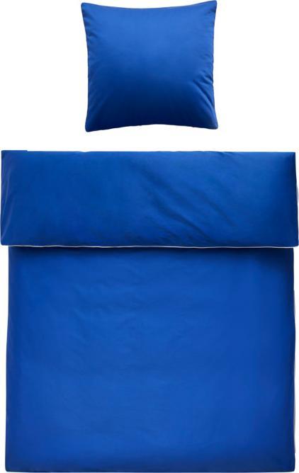

Pia’s Picks: the shade of blue that once belonged to just one person
Home textiles and accessories look striking in International Klein Blue (IKB). Even so, they’re easy to mix and match. In other words, a winning combination when it comes to adding an accent to your decor.
Right now, I’m increasingly seeing International Klein Blue pop up in interiors instead of museums. In both places, I’m positively enraptured by the colour – not just because it’s such a luminous shade of blue, but because, for a long while, its creator was the only person allowed to use it. Yves Klein was the first artist ever to patent a colour.
Exclusive colour rights
After the avant-garde painter spent the 1950s experimenting with a luminous ultramarine, 1957 ushered in his Blue Period, which later became his trademark. Choosing only to paint large expanses of monochrome blue, he was fascinated by the fact that the monochromes affected viewers differently despite being the same colour. This is down to the special formula used to create the shade. While locking in luminosity, it also ensures that different depths are created in the image when the paint is applied. To make the formula his hallmark, he patented it in 1960, christening the colour International Klein Blue (IKB). Upon his death in 1962, however, the patent expired.
The benefits of International Klein Blue
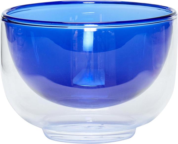
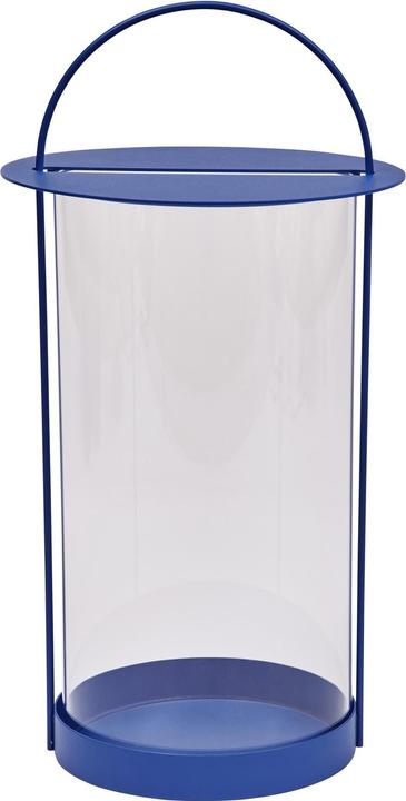
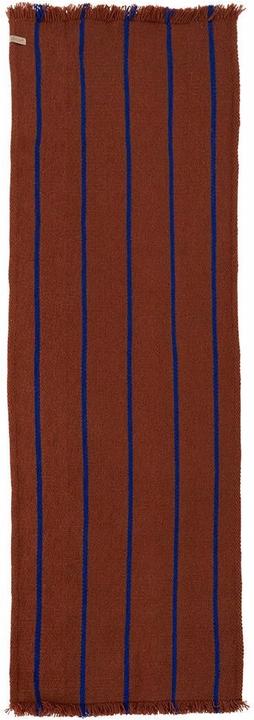
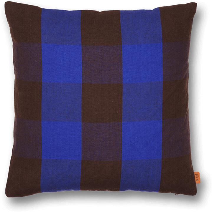
Since then, Klein’s exact formula has been used in many places, with the colour becoming especially prevalent in interior design. Brands such as Oyoy and Hübsch have made use of it in their current collections for certain home textiles and accessories. Whether it’s vases or even flowers, nothing seems safe from the mesmerising colour – including me. I like it because it’s rich, but not garish.
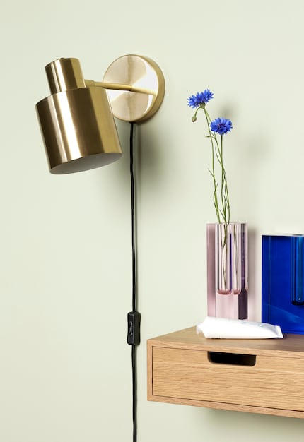
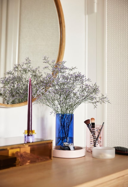
Source: Hübsch
Although the colour takes up a lot of visual space, it’s astoundingly adaptable. For instance, it harmonises well with intense oranges and mustard yellows, as well as muted shades such as pink and terracotta. It’s also radiant when mixed with lighter shades of blue.
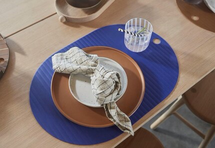
Source: Oyoy
The only thing to bear in mind when staging this popping colour is that you shouldn’t overuse it. Often, a single ultramarine accessory is enough to highlight an arrangement. Sometimes, just having the colour as a contrast within one object will do the job. On Oyoy’s Lina rug or its Evander kitchen roll holder, the blue pops like an Yves Klein painting on a white wall.
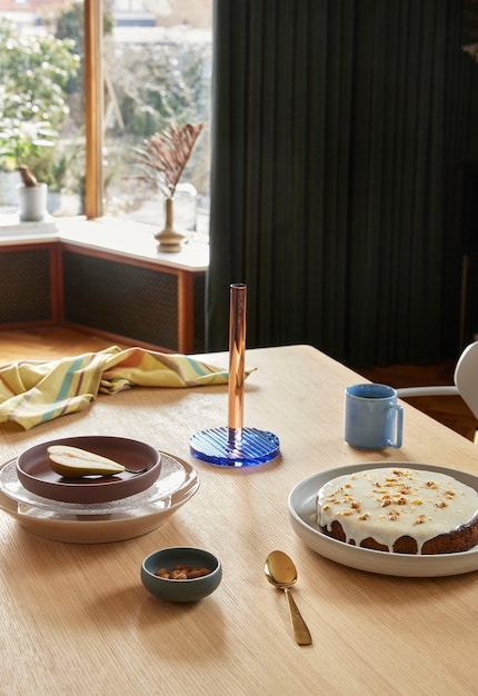
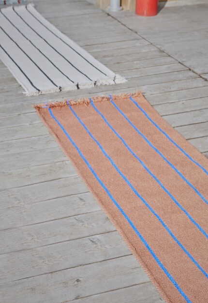
Source: Oyoy
In my Pia’s Picks series, I regularly share items from my watch list that you might like too.
Header image: Oyoy
Like a cheerleader, I love celebrating good design and bringing you closer to everything furniture- and interior design- related. I regularly curate simple yet sophisticated interior ideas, report on trends and interview creative minds about their work.
This is a subjective opinion of the editorial team. It doesn't necessarily reflect the position of the company.
Show all