Butter yellow: the trend that has taken hold
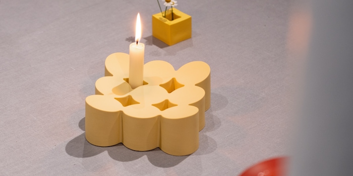
Butter yellow, that warm shade between spread and sunshine, has long been more than just a brief hype. Already celebrated at Milan Design Week 2025, Copenhagen is now also showing at the "3 Days of Design" that this colour is here to stay.
Typical for Copenhagen is a breakfast that is as simple as it is ingenious. Rye bread, cheese, fresh fruit - and coffee, of course. And butter. Without that? Half as good. That probably also applies to the interior. Nothing works without butter yellow right now.
The Milan Design Week served up the colour first. Afterwards, the «3 Days of Design» in Copenhagen served up the colour and confirmed just how versatile this trend is. Nostalgic, but never old-fashioned. Calm, but never boring.
«Bread & Butter» - a colour as design blue
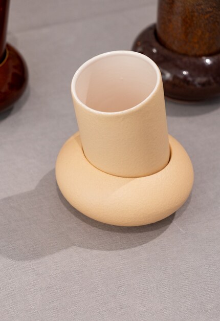
Whether as an eye-catcher or a subtle accent - butter yellow nuances fit easily into any living style. The exhibition «Bread & Butter» showed just how well. The idea? Perfect pairs that make everyday life better. «A plate without cutlery? Not possible. Salt needs pepper. And even table decorations thrive on interaction», according to the statement of the group exhibition.
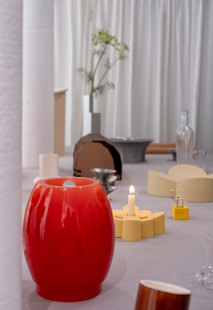
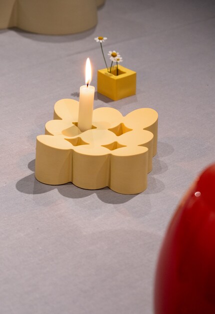
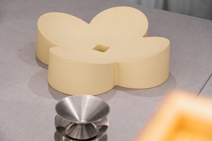
But it's about more than just function. «Food and drink are experiences. The right objects create connections - between people and with themselves.» Twelve designers from different cultures have created objects that complement each other. Some are a dream team, others emphasise the characteristics of their counterparts. And some? Only complete as a duo.
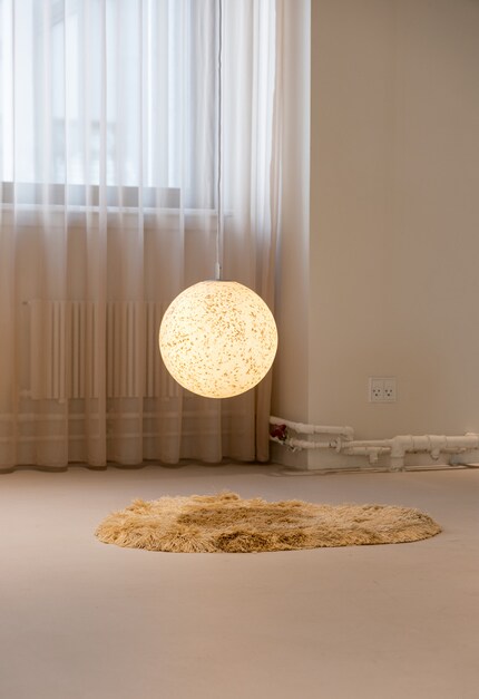
The best thing? Many pieces popped up here and there in this warm yellow colour. The colour not only brought warmth to the clean design, but also ran like a gelber red thread through the exhibition.
Normann Copenhagen shows how butter yellow works
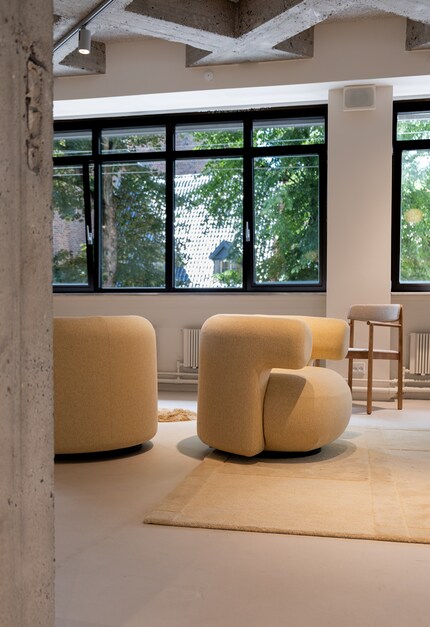
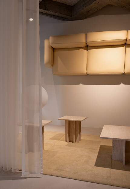
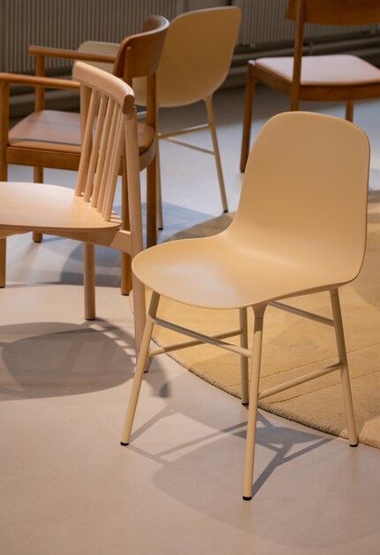
The new products from Normann Copenhagen also came in a buttery yellow colour. These included the lounge chair «Burra» with its soft, organic shape. Likewise, the modular sofa «Redo» and the stackable chair «Form», which create a perfect balance of calm and modernity in a soft yellow colour.
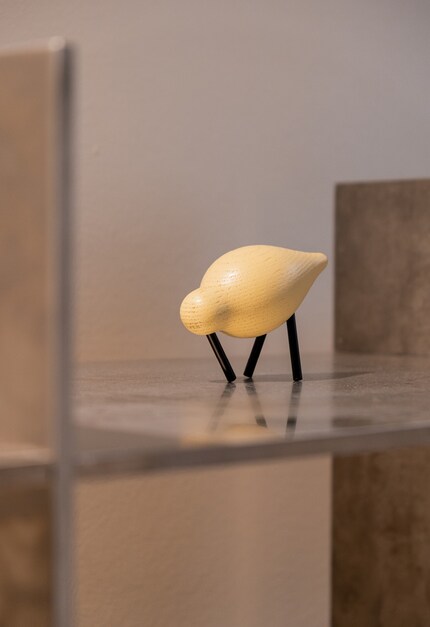
Smaller pieces are also embracing the colour trend. Normann Copenhagen presented the iconic Shorebirds (waders) by Sigurjón Pálsson - this time with a natural texture and in the unofficial colour of the year.
Why the pastel shade is so popular
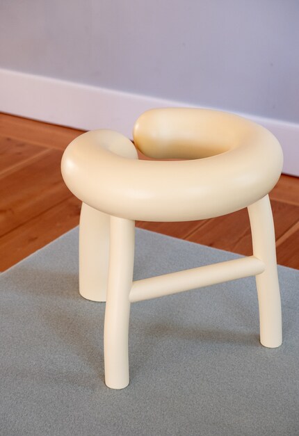
Butter Yellow is subtle, but still eye-catching. The best example: the «Churro» stool from the «Form Follows Intuition» collection by Roosa Ryhänen. With its soft, almost lively shapes, it is reminiscent of a small, friendly creature. And although it is inspired by deep-fried pastries, the buttery yellow colour provides the glow-up.
The colour also suits every season. This year, Man Of Parts presented their armchair «Rua Ipanema» by Yabu Pushelberg in buttery yellow with a cosy fabric from Keiffer Textiles. Perfect for the cold season.
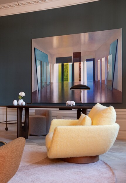
A trend that is here to stay
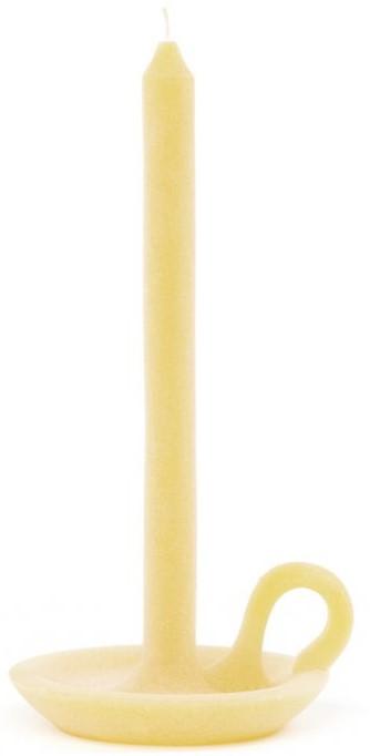
Because colour is like butter on bread, it will be with us for a long time to come. Who can resist? Not you? Then you can start small - with vases and candles. Or make a statement right away, for example with an armchair or a rug.

Ontwerpduo Tallow Sun
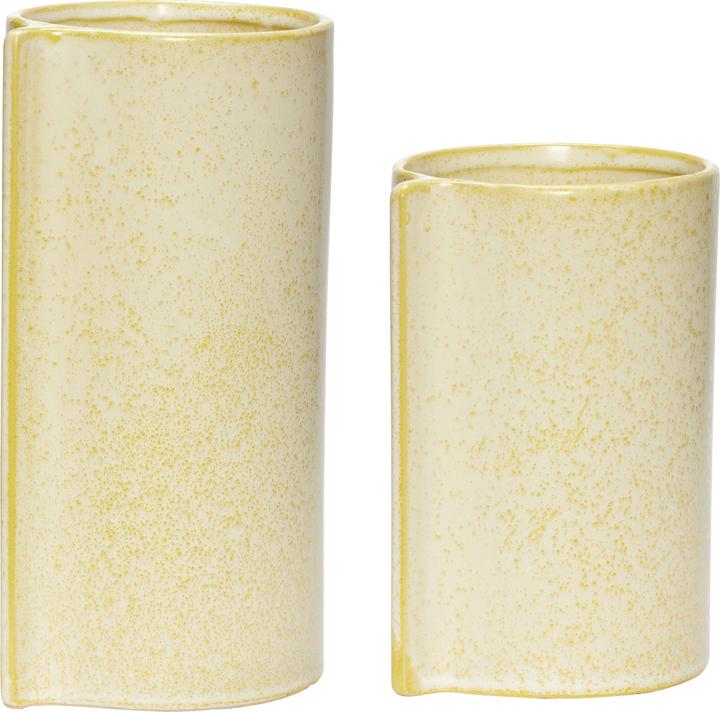
Hübsch Maurus
10.50 x 16 cm
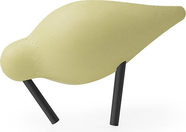
Normann Copenhagen Shorebird
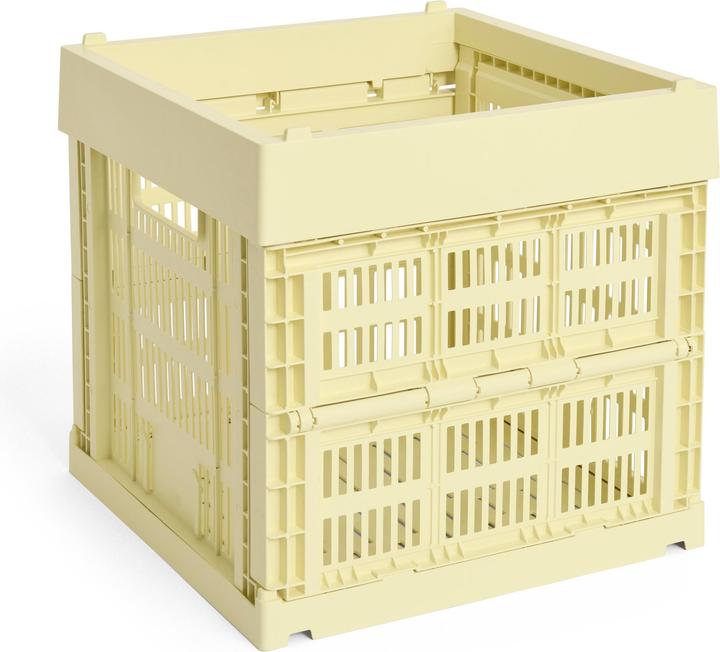
HAY Colour Crate
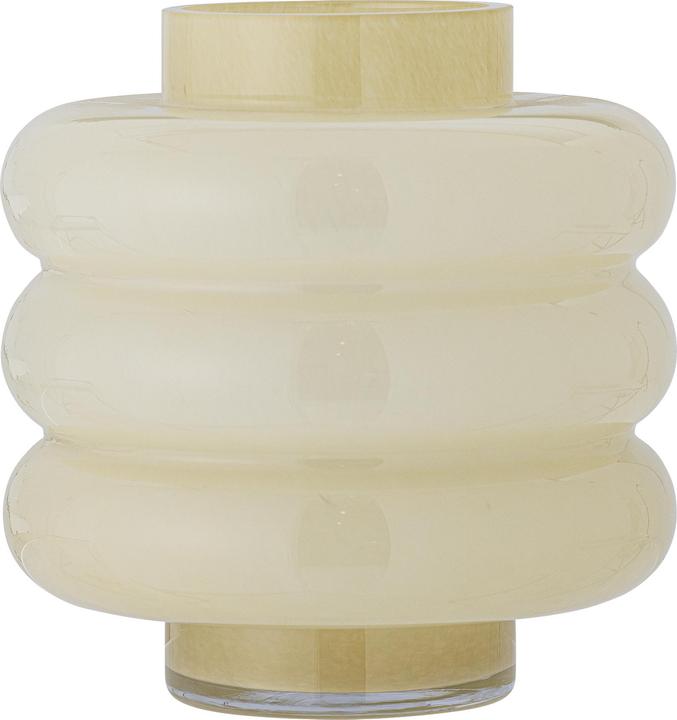
Bloomingville Sahara
4x
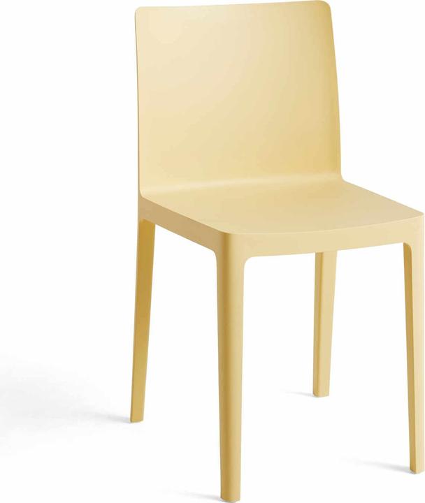
HAY Élémentaire Chair
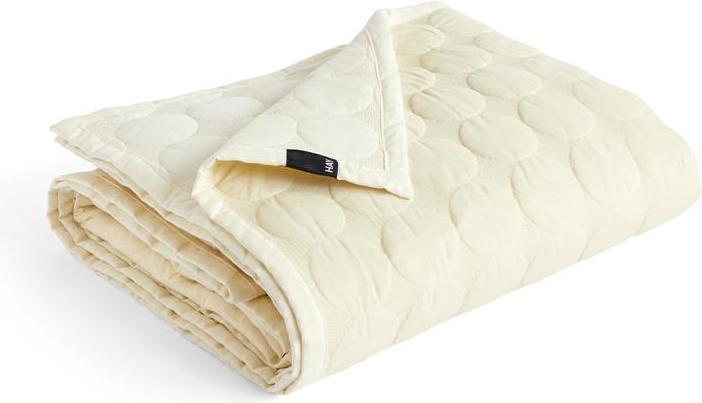
HAY Mega Dot Bedspread W260 x L260 - Ivory
260 x 260 cm
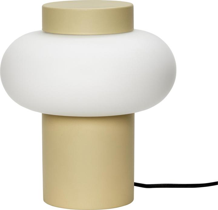
Hübsch Shura
E14
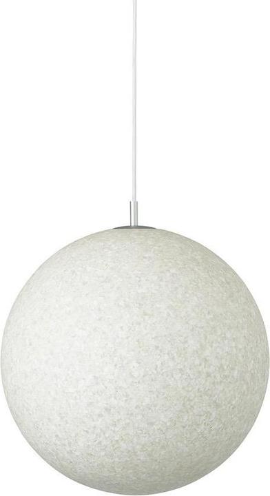
Normann Copenhagen Pix
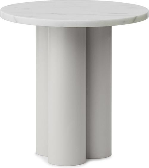
Normann Copenhagen Dit
40 x 40 cm
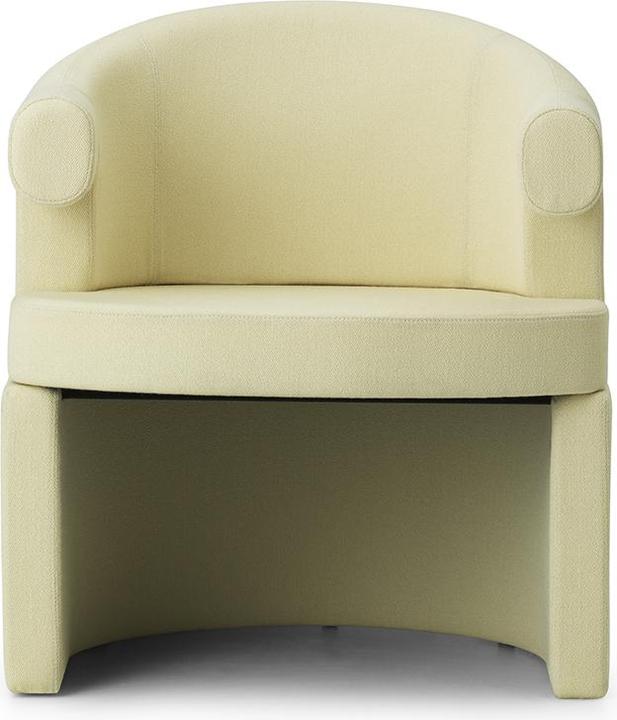
Normann Copenhagen Burra
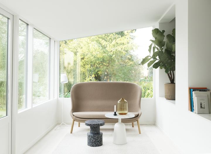
Normann Copenhagen Hyg
Like a cheerleader, I love celebrating good design and bringing you closer to everything furniture- and interior design- related. I regularly curate simple yet sophisticated interior ideas, report on trends and interview creative minds about their work.
From the latest iPhone to the return of 80s fashion. The editorial team will help you make sense of it all.
Show all