
Tasty and trendy: furniture in candy colours
Which grown-up person would want to live in a home with candy-coloured furniture? Anyone who has a good eye, a sweet tooth and knows a thing or two about interior design.
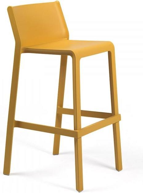
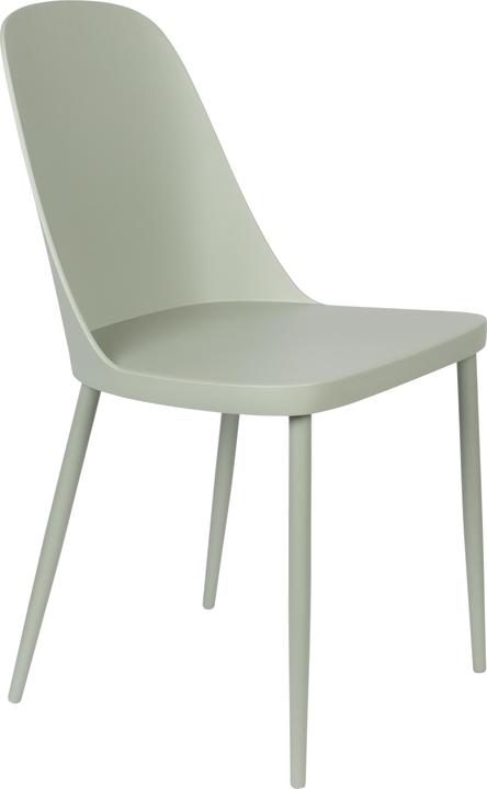
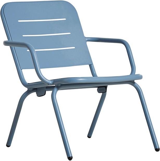
I’m in love with furniture that look like they've been coloured with the powder of street chalk – or candy. After years of going for cappuccino colours and shades of grey, it’s time for something new. Cream tones are beautiful, but they often look old-fashioned. Candy colours, on the other hand, radiate retro charm. They remind me of the edible candy bracelets I used to wear when I was a kid – only that this eye candy isn’t gone after a few minutes. Sure, it takes a little courage to implement this colourful interior design trend. You probably don’t replace a piece of furniture as quickly as you’d get a new rug or cushion, so it’s worth putting some thought into what your ideal candy-coloured piece of furniture is.
Think in colour families
Colour serves to create a sense of harmony and unity in your home. No matter what your favourite colour is, stick to the colour family that’s already in place. For example, combine mint with olive green and pink with bordeaux – or got for either warm or cool colours.
Don’t overdo it
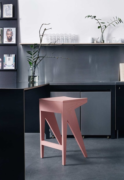
The things in your room aren’t from the same colour family? If you've been going for beige, black and white or grey so far, choose only one candy-coloured piece of furniture per room. This will create a breath of fresh air without drawing all the attention to it. The advantage of pastel shades is that they go well with shades of grey or natural tones such as brown. Unlike a bright poisonous green, a candy colour such as sage or mint is much more subtle.

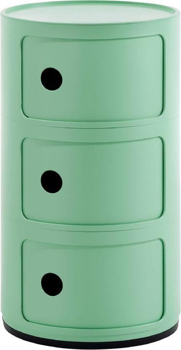
Kartell Componibili organic container furniture
32 x 32 x 58.5 cm
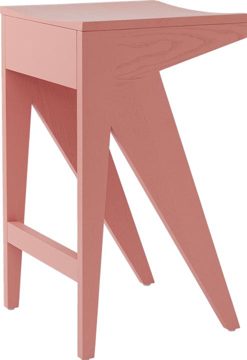
Go for bright colours
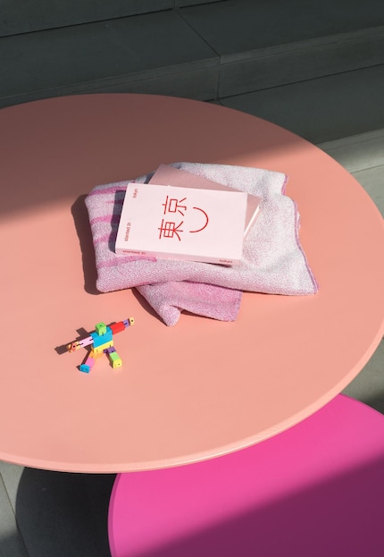
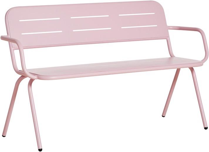
If you find pastel colours boring, go for colour-blocking by combining furniture with different bright colours. Or combine bright pink with pale pink. The concept of colour-blocking is more striking than a monochrome look, but it can look beautiful if you get it right.
Continue outside
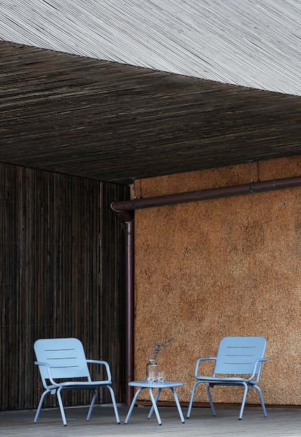
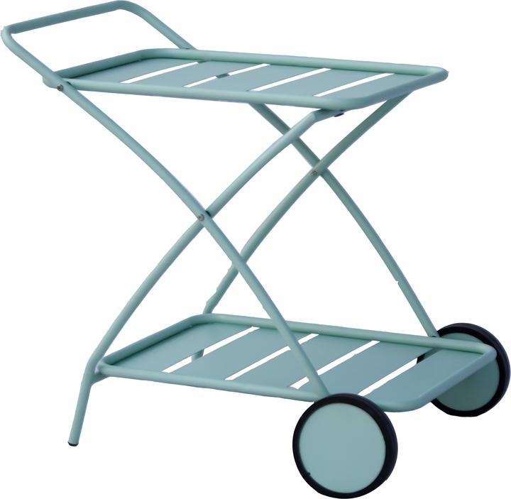
If you're not sure whether you'll get tired of a candy-coloured design, go for garden furniture in pastel shades. You’ll see them less often if they’re outside and they offer you a welcome splash of colour on grey days. In summer, colourful outdoor furniture complement the lush green of the plants or spices up house walls.
This trend may look childish to some, but you don't have to make your home look like a candy shop. After all, too many sweets aren’t good for anyone. However, if you make careful and good choices, a single piece of candy-coloured furniture is enough to create a tasty and trendy interior.
Like a cheerleader, I love celebrating good design and bringing you closer to everything furniture- and interior design- related. I regularly curate simple yet sophisticated interior ideas, report on trends and interview creative minds about their work.
This is a subjective opinion of the editorial team. It doesn't necessarily reflect the position of the company.
Show all