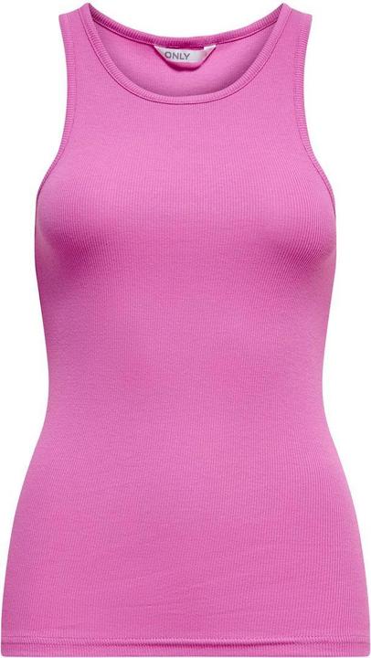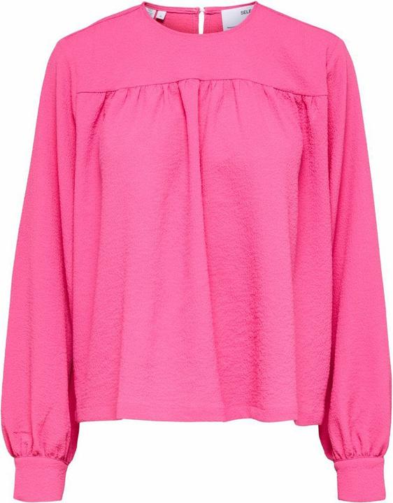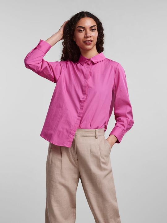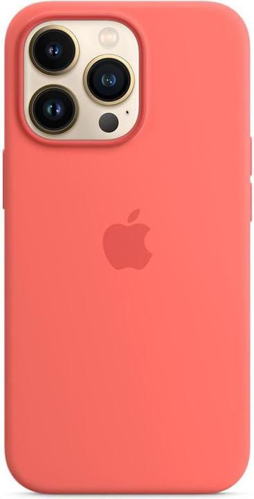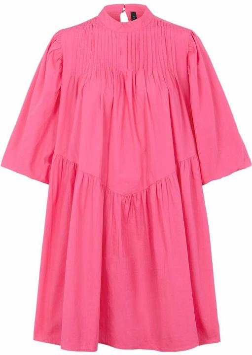

Pantone is wrong: Not Very Peri is the color of the year, but Hot Pink
The color company Pantone wanted to give the year 2022 a blue-purple hue. But when it comes to fashion, everyone is going crazy for hot pink - from Rihanna to Duchess Kate. This is how you combine the bright trend color.
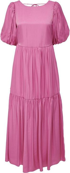
If it were up to the color elves at Pantone, the year 2022 would be completely bathed in Very Peri - a blue-violet hue created by the US company and named Color of the Year. But the fashion world seems to have chosen its own unofficial favorite: Hot Pink. This refers to various gaudy shades on the pink color spectrum.
Singer and entrepreneur Rihanna, for example, revealed her pregnancy in a barbie pink puffer coat at the beginning of the year, Latin star Maluma opened his European tour in spring dressed completely in fuchsia in front of 16,000 fans in Paris, and Duchess Kate paid her first official visit to the Caribbean a little later in a magenta metallic dress.
Riri's Pregnancy Reveal Starter Pack:
Hot pink dominates red carpets and runways
So, a bright pink that catches all eyes and just drips with confidence and energy is the chosen power color for important appearances in 2022. This was cemented in early April, when bright shades of pink also dominated the red carpet at this year's Grammy Awards.
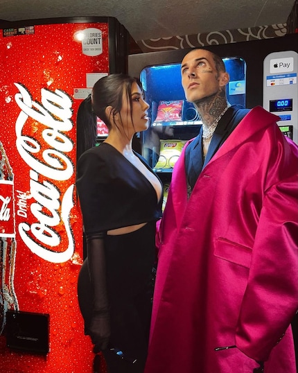
Source: Instagram: @kourtneykardash
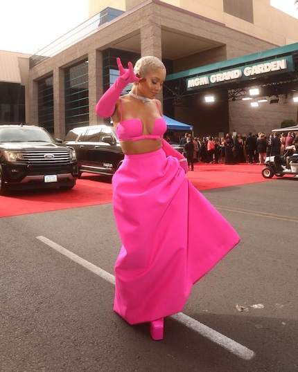
Source: Instagram: @saweetie
However, no one lived out his love for bright pink this year more excessively than Pierpaolo Piccioli. Together with Pantone, the creative director of Valentino created the color Valentino Pink PP, consistently decorated a hall with it - from the walls to the stools - and presented his fall/winter collection there. This, of course, consists mainly of monochrome looks in said color.
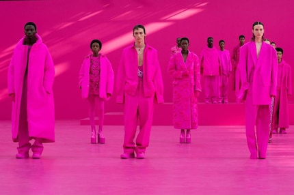
Source: Instagram: @maisonvalentino
One company predicted the hype
Incidentally, the leading trend research company WGSN aptly predicted two years ago that the current year would be all about hot pink. It named a rich magenta shade called Orchid Flower as the 2022 trend color, arguing that it stands out in both the real and virtual worlds, is versatile enough to last through seasons, and conveys a sense of positivity and escape from reality in these difficult times.
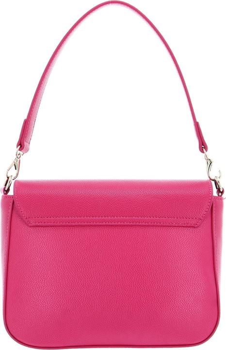
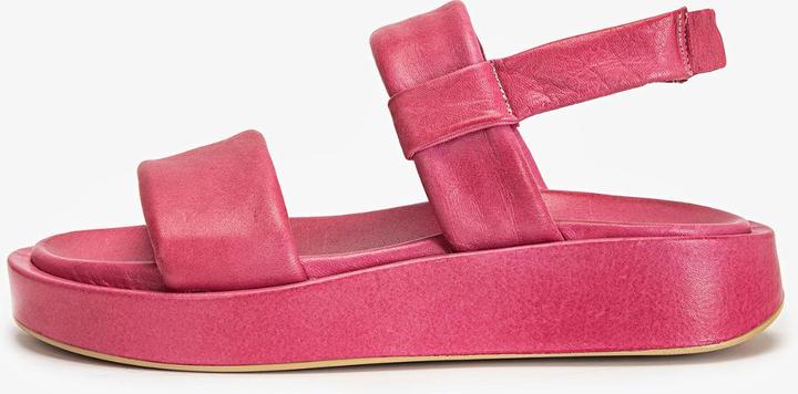
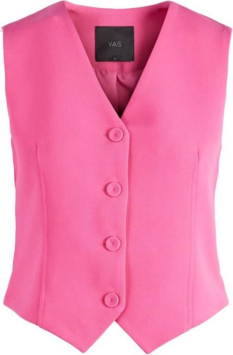
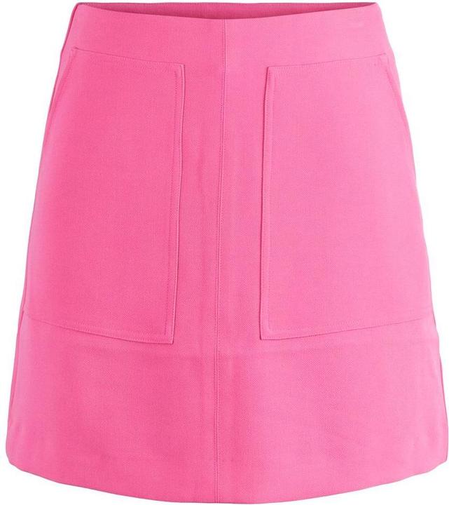
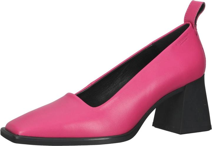
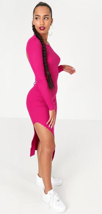
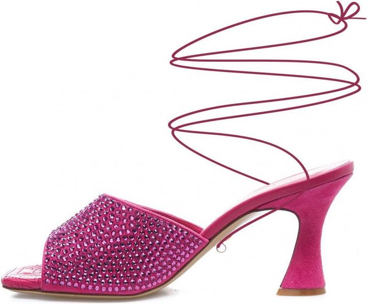
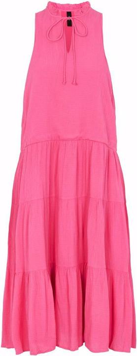
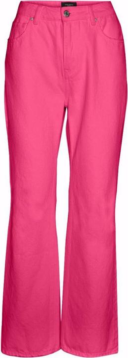
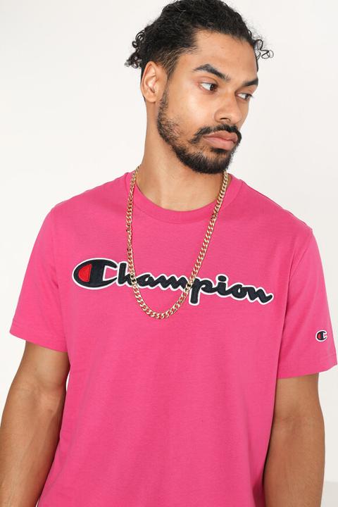
Want to dive headfirst into hot pink right now, too? Voilà, three monochrome looks:
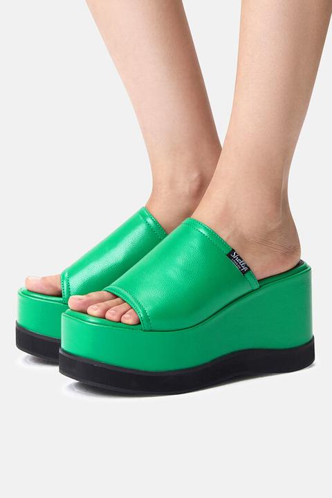
Bright pink can also be great complemented by other colors. You can't go wrong with the complementary color green:
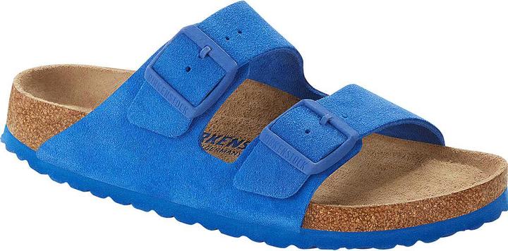
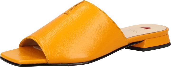
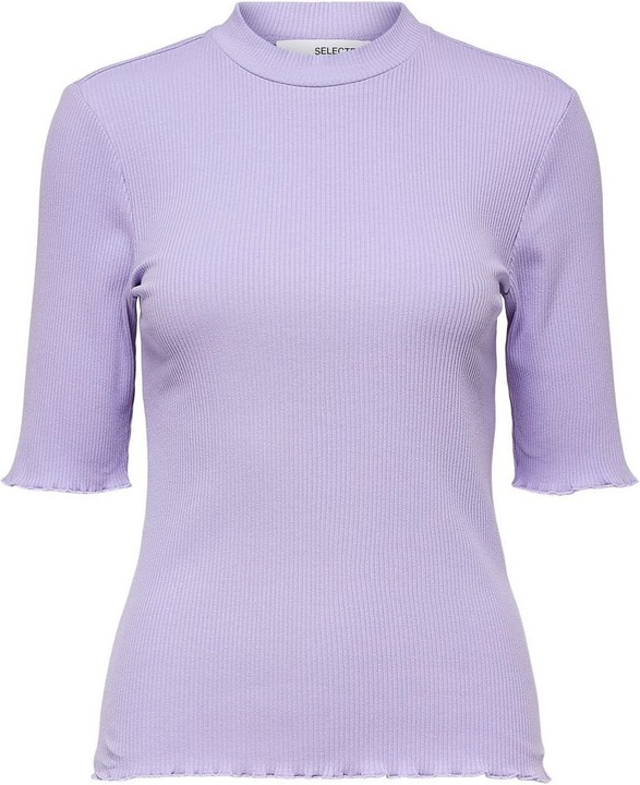
In any case, from rich tones like royal blue or orange to pastel colors like lilac or light yellow, everything is allowed - Dopamine Dressing says hello:
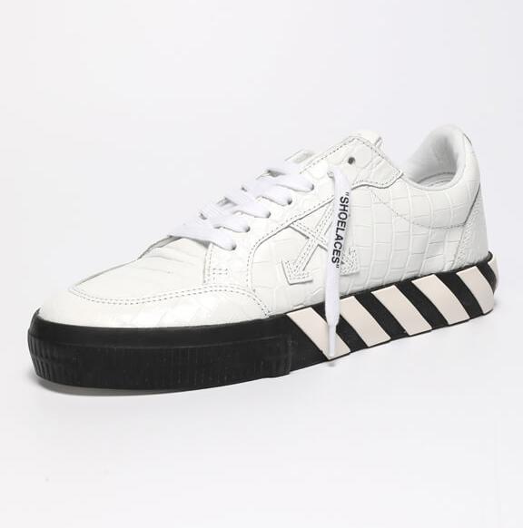
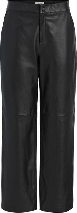
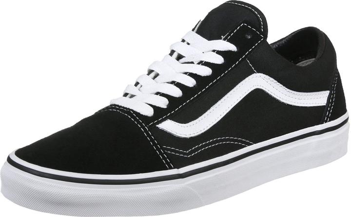
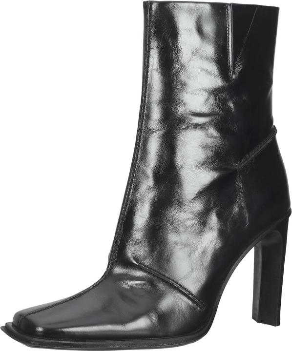
Not into color explosions? Then you can of course fall back on the classic combination with black:
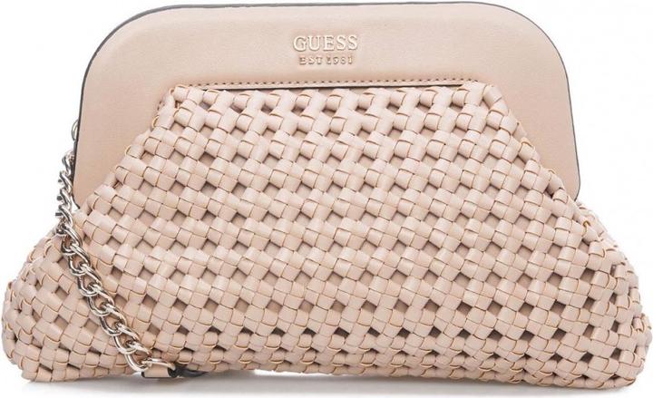
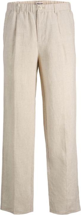
White or light beige also bring calm to hot pink, but let it shine more. Tones like cream or ecru look more harmonious than pure white:
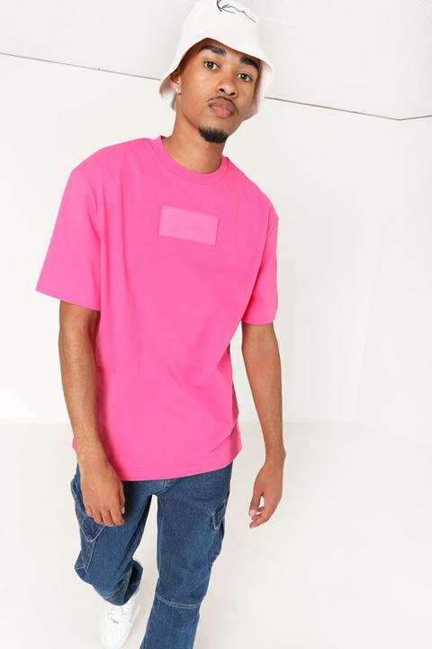
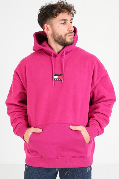
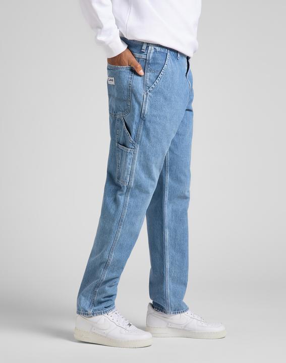
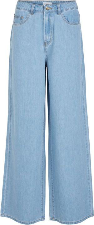
The casual jeans look also always goes:
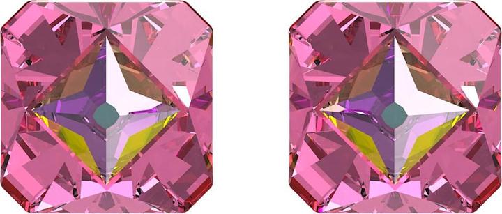
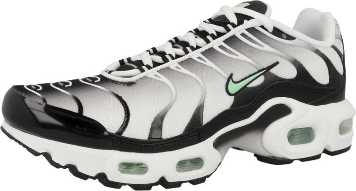
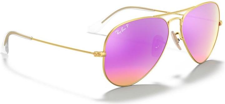
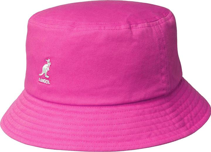
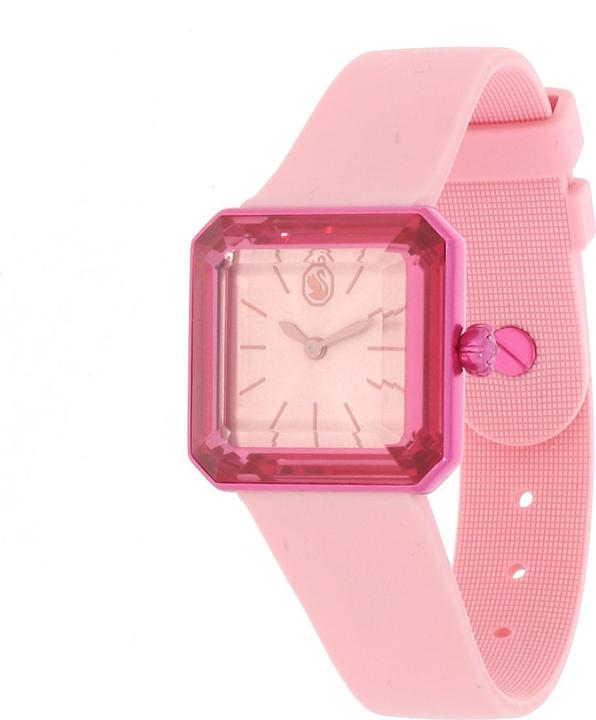
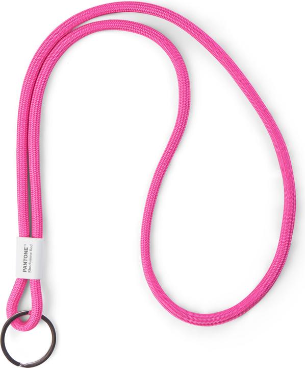
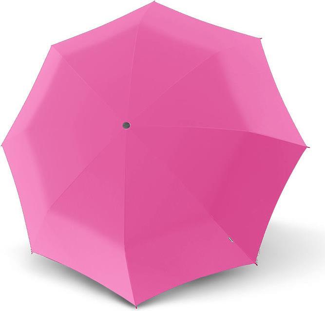
And if all this is still too much for you, you can discreetly make a statement with an accessory of your choice:
Or even more subtle - with functional accessories:
Auftaktbild: cottonbro via Pexels
Has endless love for shoulder pads, Stratocasters and sashimi, but a limited tolerance for bad impressions of her Eastern Swiss dialect.
From the latest iPhone to the return of 80s fashion. The editorial team will help you make sense of it all.
Show all