
Maybelline New York Instant Anti-Age
Green

Deciding on the right make-up in misleading shop lighting or on the basis of manufacturer images can almost only backfire. With this trick, you can still use your bad purchase.
My last foundation purchase was not only arse-expensive, it was also a complete disaster in terms of colour. You can hardly rely on online pictures and manufacturer descriptions in this category. I digested the initial pain and have now also found a practical solution.
The formula is perfect. The colour depth - i.e. the classification on the spectrum from light to dark - also fits. Only the undertone on my skin is pink instead of olive, contrary to the product information. The latter was the decisive purchase criterion for me.
Kisses to the colour theory! Thanks to colour theory, a wrong undertone can be corrected relatively easily. Colours that are opposite each other on the colour wheel neutralise each other. I can make use of this principle.
All I need is a suitable colour corrector. Such corrector colours are available in different shades. Common shades are green, pink, peach, red or yellow. You usually apply them under foundation and concealer. They help to neutralise redness or bluish dark circles, for example.
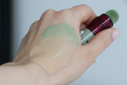

Maybelline New York Instant Anti-Age
Green
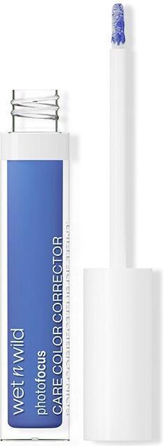
Wet n Wild Photo Focus Care Colour Corrector - Liquid Concealer 3.3 ml Blue
Blue

Maybelline New York Instant Anti-Age
Green

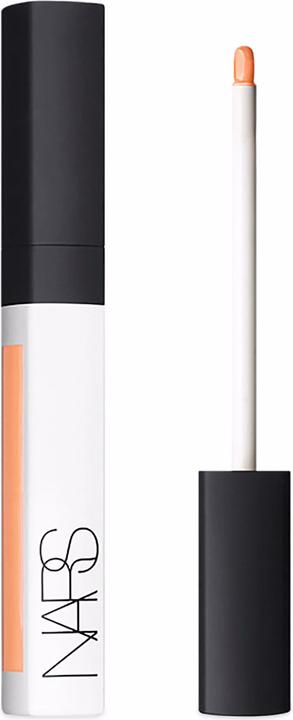
NARS Cosmetics Radiant Creamy Color Corrector
MEDIUM

Wet n Wild Photo Focus Care Colour Corrector - Liquid Concealer 3.3 ml Blue
Blue
If I want to tone down the pink in my foundation «» , I simply add a little green to it. This brings the foundation closer to my olive colour. Which corrective colour to use when and why is a science in itself. A colour wheel can serve as a visual aid here. However, if you want to understand the theory behind it properly, it takes a lot of time, patience and imagination. For a shortcut, you can search the internet for specific recommendations for your undertone. Or you can ask an AI.
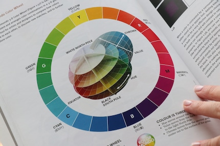
Foundations with an olive undertone are particularly hard to find. So here's a little correction guide if you're in the same boat as me.
Roughly applies to olive skin tones:
Please note that these are highly simplified recommendations. The amount, texture and opacity of your corrector also have an influence on the final result. Corrector products with a lot of white content (look pastel) also lighten the colour of your foundation and are not suitable for darker complexions in particular.
Sometimes subtleties decide how well a hairstyle or make-up looks. In the series «Beauty flash tip», I share useful techniques with you that I have either learnt from my own experience or copied from the professionals.
As a massive Disney fan, I see the world through rose-tinted glasses. I worship series from the 90s and consider mermaids a religion. When I’m not dancing in glitter rain, I’m either hanging out at pyjama parties or sitting at my make-up table. P.S. I love you, bacon, garlic and onions.
Practical solutions for everyday problems with technology, household hacks and much more.
Show all