News + Trends
Pantone is wrong: Not Very Peri is the color of the year, but Hot Pink
by Stephanie Vinzens

Pantone has done it again - proclaimed the colour of the year. I'll tell you what it's supposed to express and how you can bring it into your wardrobe.
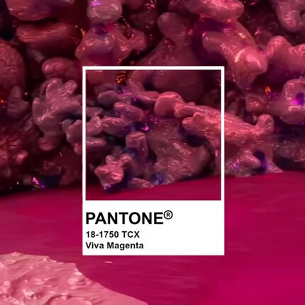
2022 was all "Very Peri", the years before that were "Illuminating Yellow" or "Classic Blue". And what colour will 2023, which is still in its infancy, be? According to the "market leader in colour communication and technology" aka Pantone LLC, the answer to this question is "Viva Magenta". This was announced by the US company on 1 December.

Viva Magenta is bold and fearless, a colour that vibrates with verve and vitality.
After Barbiecore and Balletcore were among the fashionable headlines last year,
In short, this perhaps means: "Viva Magenta" is what you make of it. I like the fact that the colour of the year leaves so much room for interpretation. I have to admit that I've been looking in vain for pink, purple and red tones in my wardrobe so far. But of course it sounds tempting to vibrate with vigour and vitality. To be bold and fearless. So maybe I'll give the flexible colour a chance? I have plenty of options. I've known that ever since I scoured our range with the Pantone radar switched on.
And if you and I are not struggling with the choice, but rather with the question of how the hell such a cheeky shade can best be integrated into the look, we should take another look together at my colleague Stephanie. She has explained this in detail using the example of hot pink:
Always in the mood for good hits, great trips and clinking drinks.
From the latest iPhone to the return of 80s fashion. The editorial team will help you make sense of it all.
Show all