
Background information
NewPipe: like YouTube for Android, but better
by Dominik Bärlocher
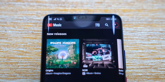
Google has had enough of the Swedish competition from Spotify: YouTube Music is now also available in Switzerland. A look at the new service and a comparison with the top dog Spotify.
A press release announces that YouTube Music (Android and Apple iOS) is now available in Switzerland. It is therefore clear that the American search giant is declaring war on the Swedish music giant Spotify.
Time to take a closer look at the app. Especially because you can now get three months of YouTube Music Premium for free. Just to get you started,
so to speak.
The first obstacle with YouTube Music Premium comes the second you want to buy the Premium trial subscription. The app asks for your credit card, but doesn't charge anything. This means that you have already added a credit card to your account, but it remains in your account as a data record for the time being.
In three months, you will then be charged CHF 12.90 per month, which is the price of the Premium plan. Spotify costs CHF 12.95 per month. A premium music app is a luxury that I allow myself, I'm currently a reasonably happy Spotify user because I also want to be able to save my music locally and adverts annoy me in practically every form. That's worth a few francs to me.
As I currently have no desire to remain a permanent YouTube Music Premium user, I have set myself a reminder for 1 February 2019 to cancel my membership again. Maybe I'll stay with YouTube Music, but I don't want to fall in. So if you're curious like me, why don't you put a reminder in your diary?
Now that I've escaped the subscription trap, I can start enjoying premium music. The app itself looks familiar, just like YouTube. But instead of the latest videos I could watch - compiled for me by computers, of course - I see generic playlists. These, I hope, will adapt to my taste in music, because I'm really not impressed by "Energetic Pop Wake-Up" or "Today's Happy Pop". Wake-Up isn't really my thing and as a cynical old journalist, Happy Pop can fuck me.
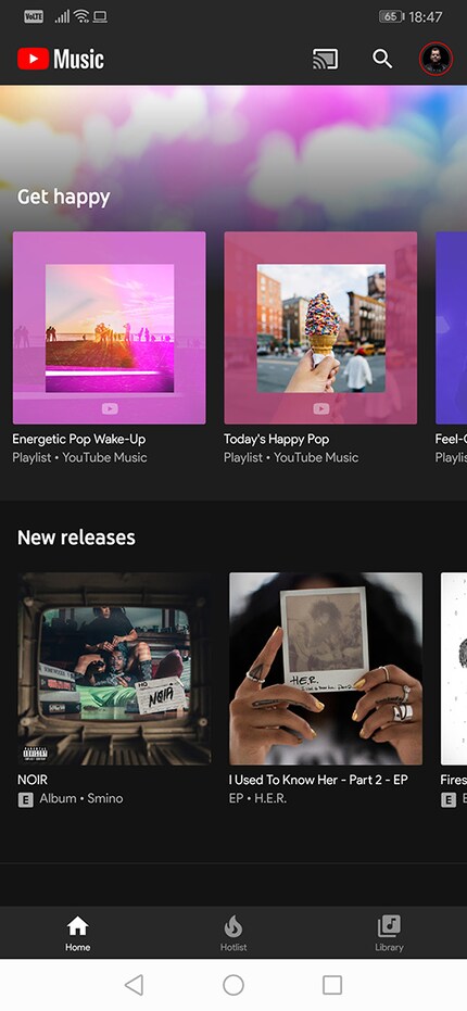
This is where I notice one of the biggest user interface sins. If I need to search for a song or artist, I have to click on the magnifying glass at the top.
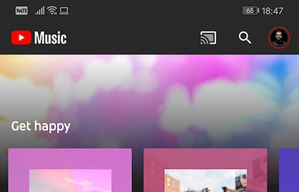
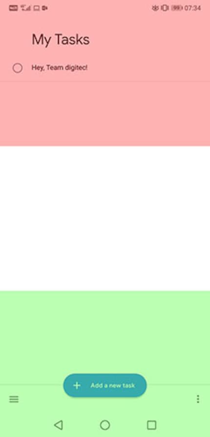
This means that the app violates one of the usability guidelines that Google itself adheres to in other apps. Google Tasks in particular stands out in a positive way, as all the controls are located in the lower third of the screen. If you hold your smartphone comfortably in your hands, you can easily reach the controls in the lower third of the screen with the thumb of the hand you are holding. In the middle third, it's just about possible, but if you want to reach the top, you have to reach round. This is even more annoying in a music app than in a checklist app.
Because as soon as you change your grip and press the magnifying glass, you have to change your grip again to type. Super annoying.
Spotify definitely has the edge here because its search is located at the bottom. But if you click on the magnifying glass, a strange new screen pops up that wants to recommend some rubbish. Before an update, however, you could double-click on the magnifying glass and then your phone's keyboard would activate and you could start typing straight away. Now I have to tap in the search field at the top to activate the keyboard and the search field.
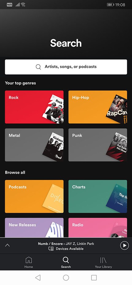
As far as I can see with my taste in music, the two streaming services are not very different at first glance. Even relatively unknown and obscure bands such as the Chinese punk band The Noname or the Indian rapper and activist Raoul Kerr are represented with their albums. Nice, but I don't really see why I should ditch Spotify and switch to YouTube Music now.
I press play and Raoul Kerr's "Ballad of the Warrior Poet" starts playing. The quality is okay, but I think it sounds kind of muffled. A look at the app settings shows: I can get more out of it and set the music quality to "Always High" for both mobile data consumption and WLAN connection.
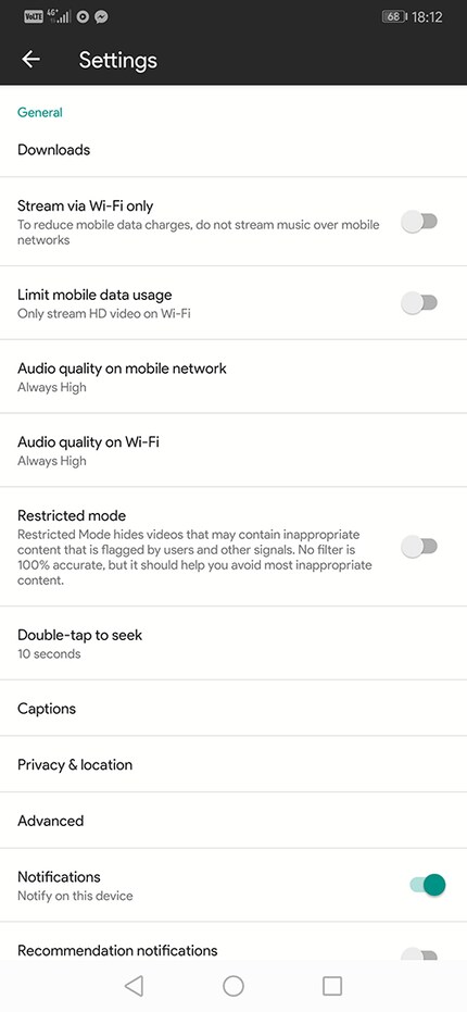
The app settings, however, are visually at odds with the rest of the app, which comes in a pleasant black colour by default. Not Amoled black, because that would actually make sense in the context of screen technologies. But that obviously doesn't work with Google's Night Modes. You can activate "Stats for Nerds" under "Advanced". What this function does, however, is not clear to me. Visually, it doesn't make any difference in the app and I'm neither more nerdy nor more statistician.
Then I click on the song to find the "Currently Playing" screen.

Spotify has the edge here too. If I swipe in one direction on the Swedes' album cover, the next song or the previous song appears. With YouTube Music, the screen is simply minimised to the bottom of the screen and I return to the previous screen. If I want to change the song, I have to use the arrow buttons at the bottom. This is again consistent with the layout of the controls in a well-designed app, but generally not really intuitive.
The full-screen mode is even more confusing. What does it actually do?
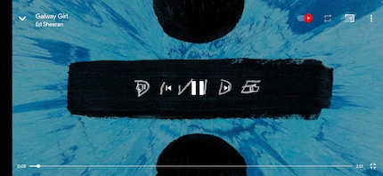
Nothing happens on the screen except that the cover is large and the controls disappear. Aha.
About the controls: The three-dot menu next to each song is pretty clever. At first, the two options "Play Next" and "Add to Queue" seem identical, but they are actually extremely useful.
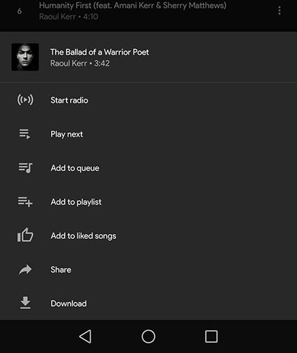
The explanation for the two functions:
Google really seems to have thought of its users. Congratulations
.
Where YouTube Music also scores points is in the search process, i.e. the time it takes to type something into the search field. This is because Spotify has a rather confusing search that occasionally spits out the strangest things. YouTube Music, however, can rely on Google's search expertise.

I particularly like the fact that there is no live search that displays results as you type. This penalises every typo. With YouTube Music, it's far less hectic and far more intuitive.
You may then be taken to the main screen of the artist you are looking for. There it becomes clear why there is a full-screen mode and why the app is called YouTube Music. You can select music videos from the list of the artist's works and then watch them.
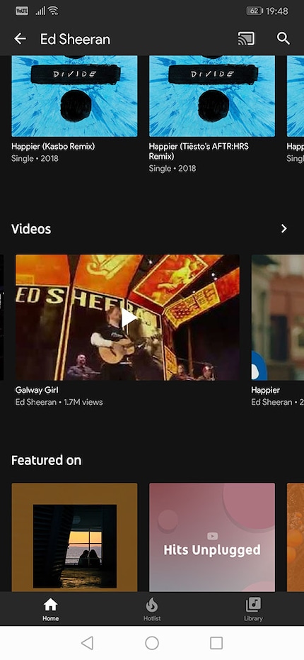
Spotify can't do that. If you're into music videos, then the choice for you is probably clear: YouTube Music. But if, like me, you listen to music at work or on the bus up the hill after work, then that's not a compelling reason for you to switch. Still, I like the feature.
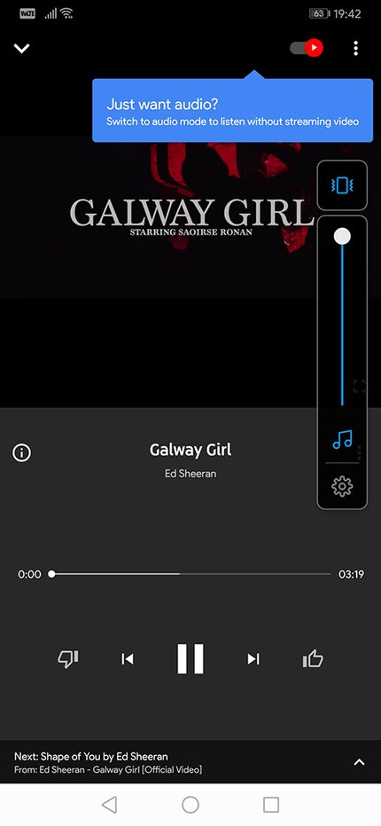
If you hold your smartphone in portrait mode, you will see a screen that plays the video and also gives you the controls known from the song screen. If you turn your phone to landscape mode, the full screen will shine.

The difference to normal YouTube YouTube is blurred here. You can only watch music videos, but not other videos like say a film trailer or a video essay, but that's okay if you just want music.
As I continue to play around with the app, I miss one thing in particular: podcasts. These are housed in the Google Podcasts app (Android and no known version for Apple iOS). This means that videos that are not music videos are not in the YouTube app and neither are podcasts. But simply music. And radio plays too.
I understand why Google has decided to go down this route, but somehow I don't feel the need for two apps for audio and two for video. Three, if you want to count NewPipe. And Google Play Music. Somehow that should fit in too, but the app is soon to be integrated into YouTube Music.
The big competitor Spotify proves that two user interfaces can have a place in one app. Podcasts are displayed differently to songs and albums. That's already possible.
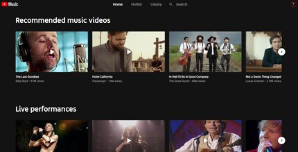
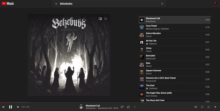
Of course, there is a browser app for the app at music.youtube.com. The interface is spartan and reflects the functions of the app. So you won't discover much here.
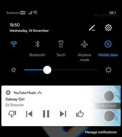
One little thing at the end that makes Spotify far less annoying than YouTube Music. Of course, you can have a widget in the pull-down menu at the top of the screen in the notification area. When you have finished listening to music on Spotify, you can simply swipe the widget to the side. With YouTube Music, this thing is extremely annoying and you can only get rid of it by switching off the music in the app and then sending the app to the background.
In the end, you're left with an app that does as much right as it does wrong. Above all, the ease of use of YouTube Music suffers and every now and then you come to a process that requires several clicks and/or swipes. This is despite the fact that the competition has long since solved this problem much more easily. The video function is nice, but in my everyday life it's not something I need very often.
Should you switch from Spotify? No. Somehow that doesn't help. Spotify is still ahead despite the 60 cents a year higher price, because the two services don't really differ in terms of the songs on sale. Except that only Spotify has podcasts and only YouTube Music has music videos.
So, that's it. I'm going to listen to some more music.
Journalist. Author. Hacker. A storyteller searching for boundaries, secrets and taboos – putting the world to paper. Not because I can but because I can’t not.
Practical solutions for everyday problems with technology, household hacks and much more.
Show all