«The colourblind mode in most games is crap»
Colour vision deficiency is much more common with men that it is with women. Some probably don’t even know they’re affected. I talked to Nicolas Franken to find out what this phenomenon is all about, what it's like to live with it and in which ways it makes technical applications and gaming more challenging.
25-year-old Nicolas Franken is a student of Multimedia Production at University of Applied Sciences in Chur and is currently writing his Bachelor thesis. He’s chosen to write about the topic «Colour blindness online».
We meet in our company bar «Pause». It’s decorated with lots of plants and has a jungle vibe about it that makes me feel relaxed and forget about the hustle and bustle of life. The perfect place to talk about the phenomenon of colour blindness.
Tell me, what’s the colour of this table we’re sitting at?
Nicolas Franken: To me, it looks white. At least in those parts that are in the sunlight.

**And those that are in the shade?**
There, it looks grey. Having said that, the way you’re looking at me tells me it’s probably a shade of green. Maybe mint green?
**That’s it, the table is mint green. What about everyday life – how to you tell what colour an item has?**
While the eye itself – or rather the colour cones on the retina – transmit a signal that is interpreted by the brain, the actual colour only develops in our minds. The information from the sensory cells is combined with information that's based on our experience. In my case, especially secondary colours cause problems. Yet, my short-sightedness is more of a problem in everyday life than my colour vision deficiency. By the way, many people don’t know they have a colour vision deficiency. It's often only discovered once people start training as an electrician or pilot.
**So Nicolas, when did you realise that colours look different to you than to others?**
Until the end of November 2018, I assumed I had a weak red-green visual impairment. My teacher in sixth grade discovered it, as he was explaining the concept of cases in the German language. He used a different colour on the white board for each case. I confused the red with the green one.
**So you didn't know the full extent of your colour vision deficiency until recently?**
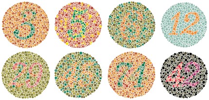
In December 2018, I was doing research for by Bachelor thesis and realised I probably have quite a severe deuteranomaly. I found out because I talked to various opticians and took the Ishihara test several times. However, this test doesn’t give scientific results on someone’s colour vision deficiency. An optician’s view can be confirmed with the help of an anomaloscope. I’m hoping to get an appointment to have my eyes tested with this instrument at the end of January.

*A few weeks after this interview, the HRR (Hardy Rand and Rittler) Standard Pseudoisochromatic revealed that Nicolas has slight to moderate red blindness or protanopia, not deutanopia.
**Are there official statistics on the percentage of the population with a colour vision deficiency?**
About eight to nine percent of men and less than one percent of women are affected by red-green vision impairment. The reason why it's more common with men is that it's a hereditary and the genetic defect is on the X chromosome. As women have two X chromosomes, a defect on one chromosome is usually compensated by the other one.
**What's the effect of this genetic defect on the eye?**
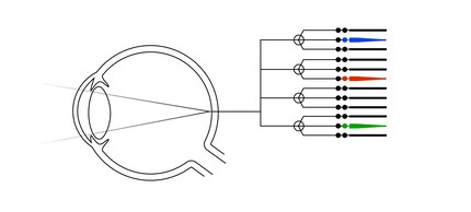
We have sensory cells or cones on the retina which enable us to distinguish colours. There are three of these cones; red-sensitive L cones, green-sensitive M cones and blue-sensitive S cones. People with colour vision deficiency have fewer cones than people with unimpaired vision.

**You did an apprenticeship in mediamatics. Did your colour vision deficiency cause any problems?**
I work with the colours that I like and that look good to me. This has always resulted in harmonious work. So I’ve never had any problems. However, during my training, I decided not to go into web design. With my handicap, what’s the point?
**What are the challenges when it comes to technology? What do you have to pay attention to when working on a layout for new media?**
There is hardly any difference between the Internet and TV: Whenever you're working with colours, it's about making sure the contrast is right. Adobe and other providers of software for graphic designers provide colour palettes which are optimised for those with colour vision deficiencies. Let's say you're illustrating a statistic. In this case, it's important to work not only with colours but also with shapes. For example, if you're creating a graphical representation with years and values as bars, these should not only consist of thin lines and different colours, but also include other distinguishing features – varying thickness of lines, hatched areas or similar. In short: If you follow the current design guidelines for barrier-free web design, everything will be fine.
By the way, there are tools that simulate a colour vision deficiency. One of them is available on toptal.com. What surprises me on this page is that when I select the deutanopia filter, there's hardly any difference between the original and the simulated website to me. Therefore, I assume this filter comes pretty close to how I see the world.

**Are you into gaming? And if so, do you know the colourblind mode which many games offer?
Yes to both. The colourblind mode in most games is crap. Battlefield 1 is a good example: In this game, the muddy ground is often brown or green, which makes it very difficult to see a small, red, opposing dot. If you activate the colourblind mode for greens, your own team's colour is adjusted, but almost everything remains as before with the opposing team. Sometimes, the red pointer gets a bit brighter. For my eyes, there's no difference.
Overwatch, unlike Battlefield 1, has a slider that lets you adjust the intensity of the colour-blind mode. I was delighted to see this, but when I tried it out, I didn't really notice any improvement. After browsing through internet forums, it became clear why this is so: It seems like the game only reduces the intensity of the colours. This isn’t of any help. In the meantime, Overwatch has released an update for this mode, which makes it possible to adjust the team colours. This makes sense.
The colour blind mode in Far Cry 5 isn't ideal either: If offers neither different colour-blind modes nor a slider for colour intensity. The colouring works well in colour-blind mode and all enemies are displayed in yellow. But if you're shot, the edge of the screen doesn't turn red, but purple. That’s confusing, isn’t it? To me, it feels like I’m gaming on an LSD high. Sure, this may make sense for some people and make sure they realise they've been shot. But who wants to play a game with ugly colours?
**What's needed to improve the quality of colourblind modes in games?**
A possibility to adjust more settings yourself to make the game suit your personal colour vision. In my opinion, a minimum requirement is being able to choose all team colours. But even if enough settings were available, the question remains whether this would actually help people perform better.

I find my muse in everything. When I don’t, I draw inspiration from daydreaming. After all, if you dream, you don’t sleep through life.
Interesting facts about products, behind-the-scenes looks at manufacturers and deep-dives on interesting people.
Show all