
Background information
30 years of Netscape, and why there’s a bit of Mozilla in every browser
by Debora Pape
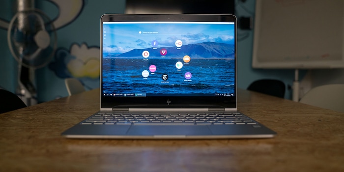
Opera Neon was supposed to overhaul the browser world and give internet users a completely new experience. A look back at a failed revolution and its heirs.
Opera is a browser with a vanishingly small market share. This is because it is dominated by Google Chrome. According to the industry service Statista, 70 per cent of internet users use Chrome, but only 2.38 per cent use Opera.
Opera is nevertheless an important element in the history and development of the internet as we know and use it. Features that users consider completely normal and commonplace, such as the Omnibox - the address bar at the top where you can also enter search terms - have appeared for the first time in an Opera version.
A look at a browser concept from two years ago shows that although Opera is no longer as strong as it was in the past, it is still working on small revolutions.
January 2017: Opera announces the large Opera Neon. Neon is a concept browser, comparable to concept cars. In other words: lots of new ideas in a pile that may not come onto the market in this form. What is special about Neon, however, is that anyone can try out the browser. The news portal PCWorld calls Neon a "radical vision of the future of web browsers".
Immediately after installation, however, you will notice that Opera does not completely break with old habits. This is because the browser not only installs itself as software that lives somewhere in your computer, but also automatically generates a tile in your start menu. If, like me, you live and work without the tiles, that's a bit scary.
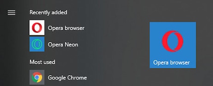
This is definitely inelegant, but is common to all versions of the browser, including the productive, current version 60.0.3254.0 of the developer version. The desire for validity in a browser or in software in general always seems so desperate.
But then it quickly becomes clear that Neon does a few things differently, but a lot that we know from more modern browsers. After all, two years on the Internet is a long time. The start screen is filled with round bubbles that function as speed dials. They give you easy access to your most visited websites. We know this from pretty much every browser, be it Firefox, Chrome or Microsoft Edge.
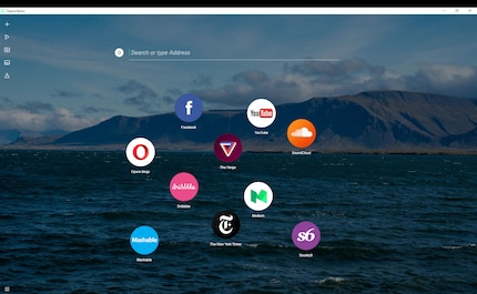
In the beginning, these bubbles are still automatically curated based on nothing obvious except the flavour of the browser's coders. Youtube here, T-shirt shop there, some news from The Verge and so on. Functionally unremarkable, but visually interesting.
The tabs are where things get really exciting. Where other browsers arrange the tabs at the top as a kind of tabbed tab system, Opera Neon breaks with this completely. The tabs are arranged on the right-hand side of the screen in bubbles similar to those on the homepage.

Neon also has some really nice features. You can save screenshots or sections of screenshots in a gallery.
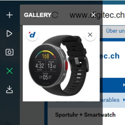
And, very nice: You can run YouTube in the background and the browser has a menu item that pops up in a bubble where you can see what you're listening to. The feature is really cool.
But the browsing experience is sometimes a bit difficult. On digitec.ch, Neon doesn't really like the display images of the articles and promotions.
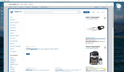
This is probably a question of the integrated adblocker, which classifies the images as an advertising element. Simply work with exceptions and you're good to go.
This is a brief overview from the user's perspective of a browser that will never exist. Because not much is left of the concept. However, the traces of Neon are recognisable in the current version of Opera if you look closely. The start page is similar to that of all other browsers.
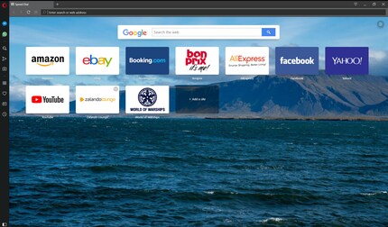
The tabs unfortunately did not survive the slide to the right. Probably took up too much screen space. They are back at the top from left to right.

What remains is the sidebar with the features, although I'm not sure if that was invented in Opera Neon. Does anyone know?
The bubbles have completely disappeared. Instead we have rectangles that do the same function. What a pity. They still looked nice. But since neon is too much of a hassle in my everyday use, I haven't tested it long enough to be able to say conclusively whether the bubbles are better than the rectangles. I like the tabs on the right, even if they are quite large and take up a lot of screen space. But then again, how many important things happen on the right-hand side in normal browser operation?
The great browser revolution has failed. For the time being. Opera Neon has not become the standard, no matter how interesting the design and functional concepts may be. But that doesn't mean the revolution will never come. It may not look like neon, but as long as people like the guys and gals at Opera keep trying new things from time to time and simply ask "Hey, users, what do you think?", I'm optimistic.
So, that's it. I'm back to working with Chrome and Firefox on my office PC. Too bad, Opera is still exciting. And if you want to download Neon, get ready for speeds from the 1990s.

Journalist. Author. Hacker. A storyteller searching for boundaries, secrets and taboos – putting the world to paper. Not because I can but because I can’t not.
Interesting facts about products, behind-the-scenes looks at manufacturers and deep-dives on interesting people.
Show all
Background information
by Debora Pape

Background information
by Debora Pape

Background information
by Martin Jud