Design star lessons: 9 successful wall clocks
In my search for the best clocks for the wall, I crawled "down the rabbit hole" and found nine exciting models that run smoothly - and are.
Wall clocks measure time and tick away. So far, so boring. However, there are now numerous designs, ranging from classic to experimental, in which the function almost takes a back seat. My personal favourites are round and more of a home accessory than a simple timepiece. They adorn the wall and can be perfectly combined with pictures, frames and shelves.
1. "Sunburst Clock" concentrates on the essentials
The American designer George Nelson created the "Sunburst Clock" in the 1950s. He fitted it with a high-quality quartz movement and gave it an unusual look for the time: Because he was one of the first to believe that the time was read by the position of the hand, he dispensed with numbers. He also saw the clock as a decorative element in the interior. That is why the shape is reminiscent of a sun. With a little imagination, you can see a circle around the hands. And the retro design certainly doesn't hurt either.

2. "Melt" plays with perception
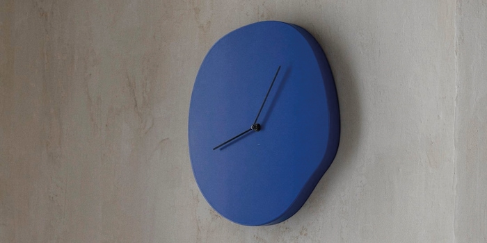
To date, numerous designs have followed in the footsteps of pioneer George Nelson and dispensed with numerals. This includes the Scandinavian brand Ferm Living. Instead, it gave the analogue clock "Melt" a slightly surreal effect à la Salvador Dalì. Its once round shape seems to melt and makes the designer piece an eye-catcher. Made from FSC-certified MDF wood, "Melt" is also available in beige and blue. Depending on which you choose, you can add a splash of colour with the clock.

Source: Ferm Living
3. "Walter Wayle II" reduces everything to a minimum
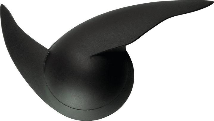
The design of "Walter Wayle II" originally dates back to 1988 and is now produced by Alessi in a second edition made of ABS plastic. The Italian brand is known for its designs with a twist. It is therefore not surprising that this clock with quartz movement is also original. It has neither a dial nor a classic round shape. Instead, it is made up of two hands. "Walter Wayle II" is therefore also a wonderful eye-catching wall decoration. And if you want to get creative, you can design your own clock face around the clock.

Source: Alessi
4. "Deep 50" is deceptive, but only visually
The Nextime analogue clock "Deep 50" also challenges our senses despite its silent movement. It has a geometric grid structure that creates visual depth and is embedded under a glass dome. The idea behind it comes from the German design studio Studio So-Lo, which plays with contemporary graphics in its designs. "Deep 50" is also available in yellow and blue.
5. "A-Wall-Clock" makes a bend around the norm
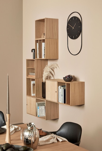
The design company Andersen Furniture focussed on contrasts for the "A-Wall-Clock" design. The wall clock combines different materials and is available in two versions - one with a black dial made of lacquered wood and a black metal ring, the other with an oak clockwork and an elegant brass ring. The two shapes that meet here are also rich in contrast: the elongated, filigree ring that encircles the round, solid dial. This interplay attracts attention.
Source: Andersen Furniture
6. "Bankers Clock" has an eye for detail
When Arne Jacobsen designed the "Bankers Clock" with Japanese clockwork for the Danish National Bank in 1971, he also created a design icon for the home. Today, the design is being reissued by Rosendahl. It looks classic from a distance. But from close up, the unconventional dial becomes recognisable: instead of numbers, it features bars divided into twelve sectors, which indicate the number of hours by moving the dot one sector outwards per hour. This creates a fine spiral from one to twelve o'clock. The aluminium watch case with its concave mineral glass front gives the watch that certain something. It makes you think "Bankers Clock" is floating in front of the wall. The designer piece is available in five sizes, with three different sizes in our range.

Source: Ferm Living
7. "Hazy" hides its function
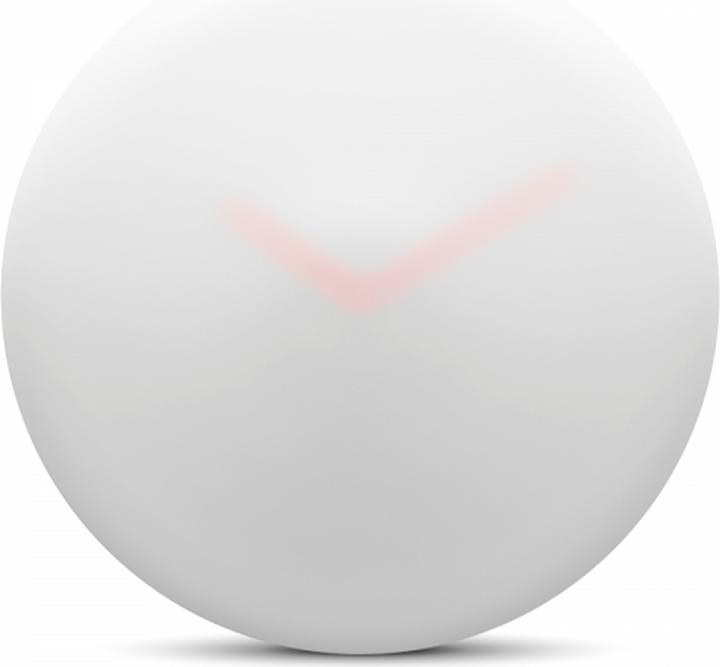
At first glance, you can only assume that the Leff Amsterdam design is a clock. The name already hints at this: "Hazy" translates as "vague". The dial is completely hidden, the hands are only visible because they glow like a tail light in the mist. In addition, the case is almost invisible against the white wall. Ivan Kasner designed the clock with a Japanese quartz movement because he liked the aesthetics of blurred images. For those who want even more blurring, "Hazy" is also available with black hands instead of orange.
8. "Istanbul"
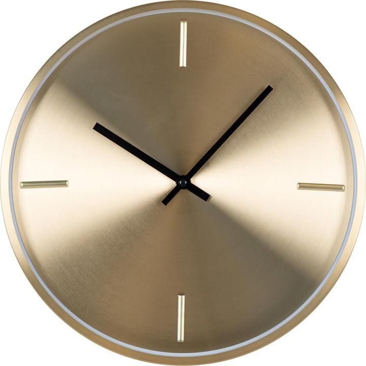
The purist design from House Nordic exudes cosiness with a touch of glamour because it is made of gold-plated aluminium. The colour has a warm effect and creates exciting reflections when light shines on it. The dial is kept to a minimum so that the surface can shine optimally. Only the hands of the battery-operated watch are black so that you can see them better.

Source: Alessi
9. "Trace" reinterprets the pendulum clock
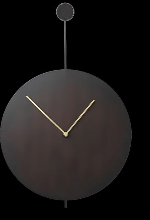
The "Trace" clock is also reduced to the bare essentials and has neither second hands nor numerals on its dial. Its brass hands stand out on the round disc made of black steel. They are the only thing that "reflects the traces of time", as the Ferm Living brand says about its design. Despite or perhaps because of its simple elegance, the clock is an eye-catcher. Not least because the clock hangs like a pendulum from a brass-coated aluminium handle.

Source: Andersen Furniture
Cover photo: Ferm Living
Like a cheerleader, I love celebrating good design and bringing you closer to everything furniture- and interior design- related. I regularly curate simple yet sophisticated interior ideas, report on trends and interview creative minds about their work.
From the latest iPhone to the return of 80s fashion. The editorial team will help you make sense of it all.
Show all
