Responsive styling and viewport dependant JavaScript.
#Screen Ranges
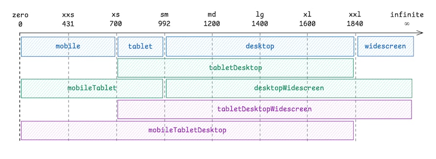
These ranges represent the most common ones we use for responsive design.

#Screen Range Media Queries
Media queries for CSS that is only applied within. All range names are inclusive, for example mobileTabletDesktop means mobile and tablet and desktop.
| Query | range start | range end |
|---|---|---|
screenRangeQueries.mobile | 0px | 699px |
screenRangeQueries.tablet | 700px | 991px |
screenRangeQueries.desktop | 992px | 1839px |
screenRangeQueries.widescreen | 1840px | Infinity |
screenRangeQueries.mobileTablet | 0px | 991px |
screenRangeQueries.tabletDesktop | 700px | 1839px |
screenRangeQueries.desktopWidescreen | 992px | Infinity |
screenRangeQueries.mobileTabletDesktop | 0px | 1839px |
screenRangeQueries.tabletDesktopWidescreen | 700px | Infinity |
import { screenRangeQueries } from "@blocks/theme";

const ExampleComponent = styled.div`
  /* mobile first */
  background-color: green;

  /* 992px to Infinity */
  ${screenRangeQueries.desktopWidescreen} {
    background-color: purple;
  }
`;
#Screen Range Effect Hook
The useScreenRangeEffect executes range based javascript. Use with caution, this may cause unwanted re-renders, when setting state.
Callback arguments
isInRangeistrueandfalseaccording to matching the rangereasonshows the phase of when it was matched, "mount" or "change"
import { useScreenRangeEffect } from "@blocks/theme";
import { useState } from "react";

const Component = () => {
  const [isDesktopOrWidescreen, setIsDesktopOrWidescreen] = useState(false);

  useScreenRangeEffect(
    "desktopWidescreen", // screen range name
    (isInRange, reason) => {
      setIsDesktopOrWidescreen(isInRange);
    },
    [],
  );
};
Hint: For touch and mouse distinction, consider using useDeviceEffect().
#Breakpoints
Breakpoint values are accessible via breakpoints object from @blocks/theme.
| Breakpoint | viewport width |
|---|---|
| xxs | 431px |
| xs | 700px |
| sm | 992px |
| md | 1200px |
| lg | 1400px |
| xl | 1600px |
| xxl | 1840px |
#Breakpoint Media Queries
Use screenRangeQueries whenever possible, breakpointRangeQueries are for special cases where the ranges are not flexible enough.
// try to use screenRangeQueries whenever possible.
import { breakpointRangeQueries } from "@blocks/theme";

const ExampleComponent = styled.div`
  background-color: green;

  /* from 0px to 1199px */
  ${breakpointRangeQueries["*-md"]} {
    background-color: red;
  }
`;
#Syntax of the breakpoint queries
Wildcard based open boundaries.
| Query | range start | range end | description |
|---|---|---|---|
breakpointRangeQueries["xs-md"] | 700px | 1199px | everything between xs (inclusive)up to the md breakpoint (exclusive) |
breakpointRangeQueries["*-md"] | 0px | 1199px | everything from zero up to the md breakpoint (exclusive) |
breakpointRangeQueries["md-*"] | 1200px | Infinity | everything from md (inclusive) to Infinity |
#Breakpoint Range Effects
The useBreakpointRangeEffect hook is a simple way to listen to the breakpoint changes in JavaScript.
The callback arguments
isInRangeistrueandfalseaccording to matching the rangereasonshows the phase of when it was matched, "mount" or "change"
For more flexibility, consider using useMediaQueryEffect() instead.
import { useBreakpointRangeEffect } from "@blocks/theme";
import { useState } from "react";

const Component = () => {
  const [inRange, setInRange] = useState(false);

  useBreakpointRangeEffect(
    "md-*", // breakpoint range query key
    (isInRange, reason) => {
      setInRange(isInRange);
    },
    [],
  );
};
#Media Query Effect Hook
The useMediaQueryEffect hook is a more flexible way to listen to the media query changes in JavaScript.
It leverages the window.matchMedia API under the hood: MDN matchMedia.
import { useMediaQueryEffect } from "@blocks/theme";
import { useState } from "react";

const Component = () => {
  const [isLandscape, setIsLandscape] = useState(false);

  useMediaQueryEffect(
    "(orientation: landscape)", // media query
    (queryDidMatch) => {
      setIsLandscape(queryDidMatch);
    },
    [],
  );
};

const CustomQueryComponent = () => {
  // You can also use this hook to build custom screen range queries
  const [inRange, setInRange] = useState(false);

  // 992px - 1199px
  const customScreenRangeQuery = `@media (min-width: ${breakpoints.sm}px) and (max-width: ${breakpoints.md - 1}px)`;
  useMediaQueryEffect(customScreenRangeQuery, (queryDidMatch) =>
    setInRange(queryDidMatch),
  );
};