Icons provide visual aid through a reduced, graphical representation.
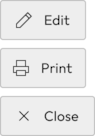
Icons highlight actions or take their place. They are also used to represent frequently performed interactions such as deleting, editing, or adding to your watch list.
Our icon design is simple, modern and user-friendly. Therefore, each icon is reduced to its minimal form, intended to ensure high readability and comprehensibility for the user.
#Usage
#Icons as actions
Some actions may be displayed to the user as icon-only.
Only use this if it is a global pattern or it is a universally recognized pattern, like searching (loupe) or deleting items (trash bin). Otherwise, this is to be avoided.
#Reinforcement of actions or links
When there’s a need to reinforce a text action with a visual hint, an icon may be the best option.
They use the same color as the text they reinforce, and behave the same way. Their states are described in the Buttons section of the Guidelines.

#Display of availability
Some information types are summarized in the form of icons to inform the user about the system or product status.
#Icons in Buttons
The most important actions in the online shop are product-related: “Add to cart”, “Compare”, “Add to wishlist” actions. For these buttons, the icons help link their actions with the features that appear in the Header-Bar.
Try to avoid using icons in other buttons.
#External links
The icon placement for external links is after the text. That is because it does not describe the action, but describes what happens to the browser when clicking on it.

#Spacing
The distances of the icons to other elements are variable and depend on the context in which they are placed.
The following distances are always calculated from the touch target of the icons. The distances and touch targets are the same for mobile and desktop
#Click target
Use Icon Buttons instead of placing icons directly on the canvas.
#Combined icons
Use Icon Buttons when displaying icons next to each other.
#Link spacing
In combination with text, icons should have a 8dp distance from their accompanying copy.

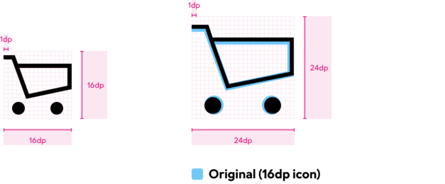
#Anatomy
Icons should be drawn in two sizes. Also, the icons should be optically adapted to the font size of the copy text.
When creating new icons, it is important to make sure that lines are positioned exactly on the pixels in the grid. This process guarantees clear contours and the icons remain legible even in small sizes.
#How to build new icons
Line icons with black contours are drawn. For very small areas in the icon, for example when the contours would no longer be visible, the area can be filled with black.
Do
Icons should be created as 1 dp contours. Their corners should be sharp and square.
Don't
Don't use rounded corners. Watch out for mismatched paths.
Do
The abstraction level should be kept high. That means keeping the level of detail low. The objective is to distill the significance of the form to its essential.

Don't
This icon uses a detail level that is not needed to signify telephonic communication.

Do
Stay flat. The idea of a printer is here still transmitted without using perspective.

Don't
This icon uses perspective to communicate the form of the printer.

Do
Icons should only be shown in body copy before their respective keyword as a means of reinforcing their significance.

Don't
Don't explain icons, if they're not being understood, they need either a redesign, or you're using them wrong.

Do
Use icons in buttons for the "Add to cart", "Compare", and "Add to wishlist" actions — these are coupled to the header-bar lists and benefit from the visual reinforcement.

Don't
Avoid using icons in other buttons. It dilutes the meaning of icons and weakens the association between those key actions and their counterparts in the header-bar.